Every brand should have its set guidelines for its logo and design. In this way, they can stand out from the crowd as an individual.
Riseup Labs has its branding guidelines as well. Once you know about it, you will love using it for your work because they are an essential part of the brand strategy.
We are very proud of our logo, and we require that you follow these guidelines to ensure it always looks its best. Our logo is the combination of a modern and straightforward wordmark with the icon.
Our logo is Riseup Labs' face - the primary visual expression that we use to identify ourselves. Which means that we need to be careful to use it correctly and to do so consistently.
Clear space prevents type, imagery, or other graphic elements from interfering with our logo's legibility. No graphic elements should encroach the border around the logomark. This space is determined by 50% height of logomark on each side. Measure the clear length for primary logomark by the height 36 px.
Establishing a minimum size ensures that the logo's impact and legibility are not compromised in the application.
Riseup Labs logo should never be smaller than 70px in digital or 20mm in print.
Logo Variation & Background
Full Color
Riseup Labs logo looks like this in full color. You should and must use it like this when needed, colorful, wherever necessary. Check and take care of the copyright mark there.
Colorless Logo
Riseup Labs logo looks like this in no color. You should and must use it like this when needed, colorless, wherever necessary. Check and take care of the copyright mark there.
Full color with Background - 1
Riseup Labs logo looks like this in full color with an orange background. You should and must use it like this when needed, in full color with the orange background, wherever necessary.
Full Color with Background - 2
Riseup Labs logo looks like this in full color with a black background. You should and must use it like this when needed, in full color with the black background, wherever necessary.
For Secondary Branding
Sometimes, you have the choice of not using the "Labs" word in the logo. However, that is a secondary branding option and a rare case most of the time. Check out the following examples.
Full Color
Full color with Background
Full color with Background
Full color with Background
Full Color
Full color with Background
Full color with Background
Full color with Background
N.B: This is a more independent version and format for our own product element's secondary branding but in a rare case. There will be no Colorless version for this will be only used in digital media.
Riseup Labs has always been white, black & orange, and that won't change. While embracing a much more colorful language in our brand communications, Riseup Lab's orange is our resting colour, used only in situations where the brand palette is not being used.
Take your pick #FFFFFF #211E1F #EA5400
Rules with Colours
Riseup Labs white, black & orange should only ever sit on a white, black, gradient, or non-duo-toned photographs. Riseup Labs white, black & orange will mainly exist in the app. Riseup Labs white, black & orange should never be used as/or with a color from the brand palette or a duo-toned image.
Black or White
Gradient Color
On Image
Brand Palette
Don’t use logo color as background color
Duotoned Image
Logo Misuse
Avoid these silly mistakes
It is important that the appearance of the logo remains consistent. The logo should not be misinterpreted, modified, or added to. No attempt should be made to alter the logo in any way. Its orientation, color and composition should remain as indicated in this document — there are no exceptions.
No
Do not use the old stacked version of the logo
No
Do not apply a gradient to the icon or wordmark
No
Do not rotate the logo
No
Do not resolve the logo in different colours
No
Do not distort or warp the logo in any way
No
Do not outline or create a keyline around the logo
No
Do not use multiple logos or use the logo in a repeating pattern
No
Do not substitute any colors of the logo or have multiple colors within the logo
No
Do not use country name or programme name next to the Riseup Labs logo
The Typeface Family
Only three font styles are to be used for the typeface family. So, kindly check and verify if it matches your style.
Title: Helvetica
All Headings: Circular
All Description: Open Sans
The Following Font Size is Applicable for Any Document Related work or PowerPoint.
Title : HELVETICA - SIZE 28
Heading 1 : Circular - Size 22
Heading 2 : Circular - Size 18
Heading 3 : Circular - Size 16
Heading 4 : Circular - Size 14
Heading 5 : Circular - Size 12
Heading 6 : Circular - Size 11
All description : Open Sans - Size 11
Special Case for Design Related Work
You are fixed to use only the three font styles.
But you will have great freedom to use any of the fonts inside these three fonts’ Family- Helvetica (4 family fonts), Circular (8 family fonts), Open Sans (8 family fonts).
You also have the freedom to use any size as per your requirement for the Promo Materials. Yet you’re fixed to use fonts in the format mentioned above under "The Typeface Family".
N.B : - Title & Headings should be always in Bold font;
Title & Heading text can only be used in Capital case for a full sentence or Capital case per word;
Description can be used in Bold/Italic/Regular, but the font size must be the same;
Any Hyperlinks should follow the #ff3400 font color.
For print materials such as- leaflets, banners, etc., these sizes may vary, but you must follow the text size ratio.
Special Case is only applicable for Graphical elements for designers.
Font Colour
All the design and promotional materials must follow the below color format.
Check the colors with their color codes, and below that, you will get the color codes to take and start working on immediately.
You are free to make gradient colour from similar colour properties/family, e.g., Gradient from Black variations, Gradient from Orange variations. But you cannot make a gradient with Black/White with Orange, as these are in the different colour family.
Brand Identity of Website, Mobile Apps, Games, or Other Projects
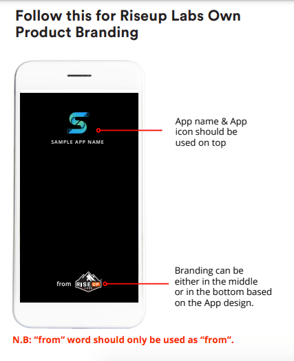
Follow this for Riseup Labs Own Product Branding
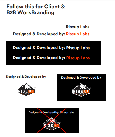
Follow this for Client & B2B Work Branding
N.B: Name of the company and company logo shouldn’t be used together. Either one of the item will be used.
Guideline for PowerPoint Presentation Use
COVER PAGE:
- For company presentation, the cover page format will be in this sequence “LOGO, TAG LINE, WEBSITE LINK”.
- For product or other promotional materials it isn’t fixed. However, in that case, cover page will have - “TITLE / HEADING, LOGO and WEBSITE LINK”
MIDDLE PAGES:
- For any kind of product presentation, in the Bottom or Top right corner logo needs to be used as “from Riseup Labs Logo”. “from” word should only be used as “from” based on app presentation.
- For company presentation, only “Riseup Labs Logo” needs to be used in all pages at the Bottom or Top right corner.
4. Maintain proper exclusion zone while using the logo.
5. Always use Helvetica (for Title), Circular (for any Headings), Open Sans (all description) font as per the guideline.
6. Helvetica Title should and only should be used on the Cover or Top of your Material.
7. DON’T forget the Font Size in your material. It has to be in the same format, and you can choose any Heading format for your material.
8. Always use Riseup Labs color palette.
9. Do not use the country name or program name next to the Riseup Labs logo.
10. When in doubt, ask the Product Manager, or if you’re an external person, shoot an email to contact@riseuplabs.com.
N.B: If you want a copy of our Brand Guidelines, if you are designing communication materials related to Riseup Labs or if you have any other requirements, questions, comments or feedback, please contact us.
This website uses cookies to improve your experience while you navigate through the website. Out of these, the cookies that are categorized as necessary are stored on your browser as they are essential for the working of basic functionalities of the website. We also use third-party cookies that help us analyze and understand how you use this website. These cookies will be stored in your browser only with your consent. You also have the option to opt-out of these cookies. But opting out of some of these cookies may affect your browsing experience.
Necessary cookies are absolutely essential for the website to function properly. This category only includes cookies that ensures basic functionalities and security features of the website. These cookies do not store any personal information.
Any cookies that may not be particularly necessary for the website to function and is used specifically to collect user personal data via analytics, ads, other embedded contents are termed as non-necessary cookies. It is mandatory to procure user consent prior to running these cookies on your website.
Md. Moshiur Rahman
General Manager, Business Development
Md. Moshiur Rahman is the General Manager of Business Development at Riseup Labs, with over 13 years of experience across sales, marketing, operations, and strategic growth. Over his 8+ years at the company, he has advanced through key leadership roles including Assistant Manager of Training, Management Officer, and Operations Manager (Sales & Marketing). In his current role, Moshiur drives business expansion, client acquisition, and long-term partnerships while aligning technology-driven solutions with evolving market demands.
Md. Rezwanul Haque
Head of Operations, Admin & Compliance
Md. Rezwanul Haque is the Head of Operations, Admin & Compliance at Riseup Labs, where he oversees administration, finance, budgeting, process improvement, and regulatory compliance. With strong expertise in operations management and strategic planning, he ensures financial discipline and legal compliance while streamlining processes for sustainable growth. Rezwanul also leads recruitment, onboarding, and performance management, and guides compliance frameworks including VAT, taxation, and internal controls.
Maria Santos
VP of Sales, Global Market (Philippines)
Maria Santos is the Vice President of Global Sales at Riseup Labs, representing the company from the Philippines to international clients. With expertise in BPO, ITO, and KPO, she helps organizations scale operations, optimize processes, and achieve measurable results. Her career spans outsourcing, technology solutions, and knowledge services, covering the full client lifecycle from acquisition to long-term partnerships. Before outsourcing, Maria worked as a scientist and product developer, sharpening her analytical and problem-solving skills.
Christophe M. David
VP, Business Development (Europe)
Christophe M. David is the Vice President of Business Development for Europe at Riseup Labs, where he drives commercial strategies and client relationships across the region. With a diverse career in executive roles, he combines strategic vision, business effectiveness, and human sensitivity. In the early 2000s, he discovered Bangladesh and was inspired by the humanity, commitment, and resilience of its people. This experience led him to engage in meaningful projects supporting economic and industrial development.
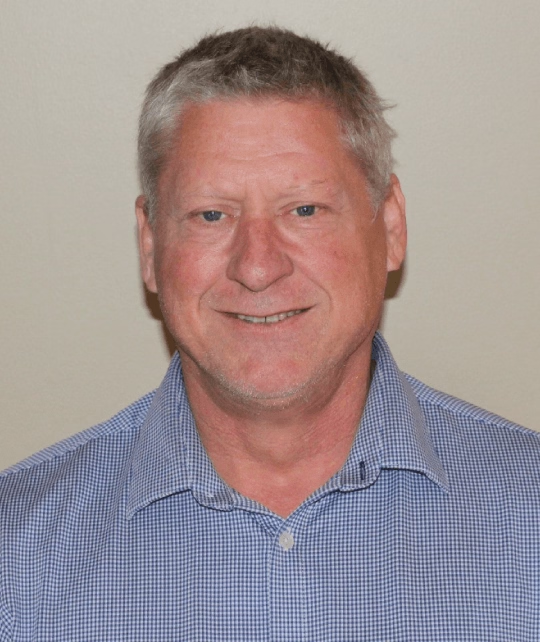
Michael Longwell
VP, Business Development (US)
Michael S. Longwell is the Vice President of Sales, North America at Riseup Labs, with more than 20 years of experience in consultative contact center BPO solutions. He helps organizations enhance customer experience and lifetime value through front-office, back-office, and KPO services. Before joining Riseup Labs, Michael was Sales Director for North America at SuccessKPI, a SaaS analytics platform using AI to transform contact center performance.
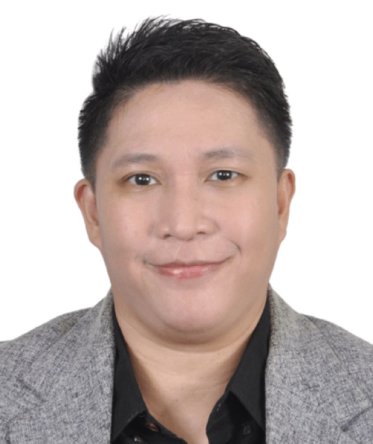
Hamim Zakaria
Head of Business Development, Global Market
Hamim Zakaria is the Head of Business Development at Riseup Labs, bringing 17 years of experience across software, game development, staffing solutions, and the BPO industry. Joining the company as a Business Development Manager, he played a pivotal role in shaping its transition into global B2B services and steadily rose to his current leadership role.
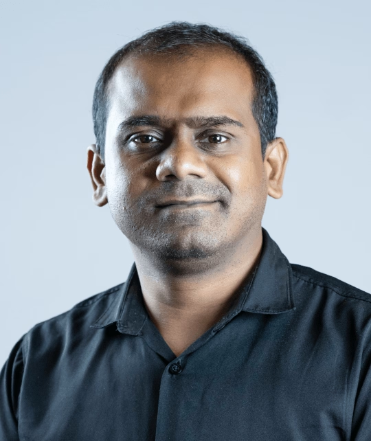
Enamul Hoque Ratul
Head of Operations, Growth & Strategy
Enamul Hoque is the Head of Operations, Growth & Strategy at Riseup Labs, where he drives operational excellence, business expansion, and long-term growth initiatives. With over nine years at the company, he has advanced through roles including Operations Manager and Product Manager, building expertise in streamlining processes and aligning strategies with organizational goals.
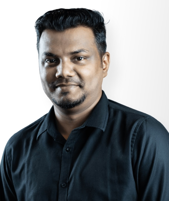
Ariful Islam Shakil
Director, Business Development
Ariful Islam Shakil is the Director of Business Development at Riseup Labs, with 15 years of extensive experience in strengthening local market presence and driving sustainable growth in Bangladesh’s technology sector. He specializes in building strategic partnerships, expanding client networks, and delivering innovative digital solutions tailored to client needs.
Md. Rafiquzzaman
Director, Product & Technology
Md. Rafiquzzaman is the Director of Product & Technology at Riseup Labs, with more than 15 years of experience driving innovation in digital solutions. A graduate in Computer Science and Engineering from Shahjalal University of Science & Technology, he is skilled in app, game, and web development, product analysis, and project management.
Ershadul Hoque
Founder & CEO
Ershadul Hoque is the Founder & CEO of Riseup Labs, a tech entrepreneur, innovator, and builder with nearly two decades of experience leading digital transformation projects worldwide. He has played a pivotal role in designing and delivering intelligent solutions across software, games, immersive technologies, BPO services, and AI-powered platforms.
Contact Us Now
Welcome! My team and I personally ensure every project gets world-class attention, backed by experience you can trust.
Welcome! My team and I personally ensure every project gets world-class attention, backed by experience you can trust.
Ershadul Hoque
CEO, Riseup Labs
Contact Us Now
Start a conversation with our team to solve complex challenges and move forward with confidence.
Welcome! My team and I personally ensure every project gets world-class attention, backed by experience you can trust.
Welcome! My team and I personally ensure every project gets world-class attention, backed by experience you can trust.